Financial Calculator
Client
Porsche Digital
Role
Product Designer
Extract
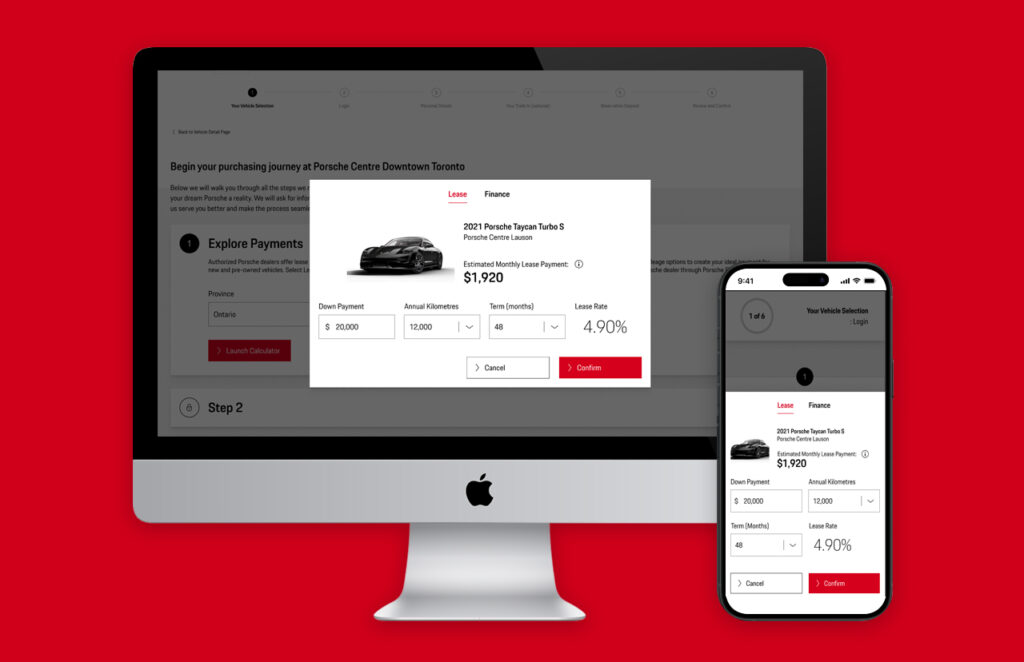
I designed a financial calculator for desktop and mobile views, so the customers could start their journey for purchasing a luxury sports car. My process included heuristic evaluation of the current version, proto-personas, journey mapping and user testing, along with mockups using their Design System.
Context
I worked with Porsche Digital Canada to design a new experience for their financial calculator. Their current product was designed and developed by non-designers, and since Porsche is a brand who takes design very seriously across all of their brands and products, they needed something more user friendly and that followed their design guidelines, considering the technical and legal challenges that this user-facing service has.
I was the only designer working on this project, so I defined my own process and did some research with the stakeholder. I also had access to some users and potential users, so I had the chance to validate some of my assumptions with some testings.
Challenges
The main challenge for this project was to redesign the calculator not just for their customers, but also validating every legal and technical aspect of it. As I learned while I was making progress, turns out that false information or an error during calculation using this digital tool could be used as an argument for legal procedures and even for money laundering, so it was highly important to validate and iterate with the legal team.
As part of my design process, I also came up with the following strategy:
- Create an Heuristic evaluation of the current calculator
- Facilitate a proto-personas workshop with stakeholders
- Creat swimlane flows to map the entire process for a customer that wants to purchase a luxury sports car
- Design high fidelity mockups, validate and iterate with both stakeholders and legal department
- Build a design prototype
- Facilitate user testings to validate hypothesis and rapid-iteration
Actions
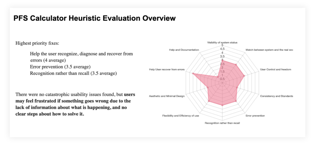
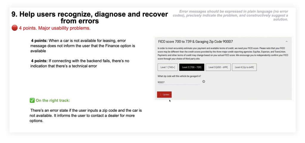
The first step was to understand the areas of improvement for the current product, so I did a heuristic evaluation based on the 10 usability herustics by Nielsen-Norman.
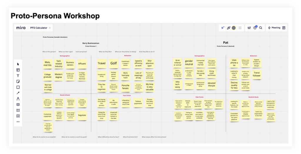
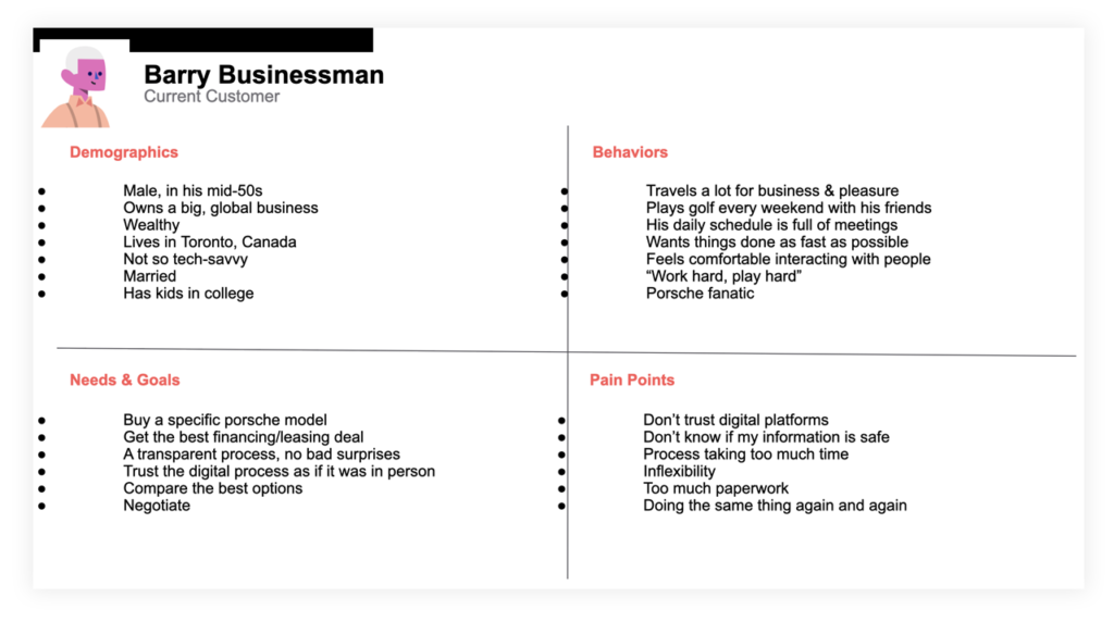
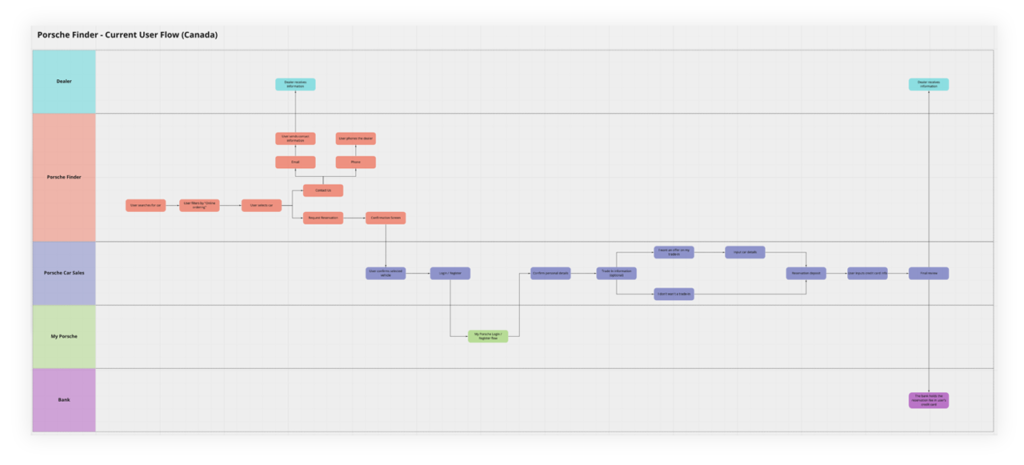
I also facilitated a proto-personas workshop with the stakeholders to be sure that we were aligned about the customers that would be using the calculator, and then I proceeded to create a swimlane flow, so I could understand better the complete user flow from the star of their journey.
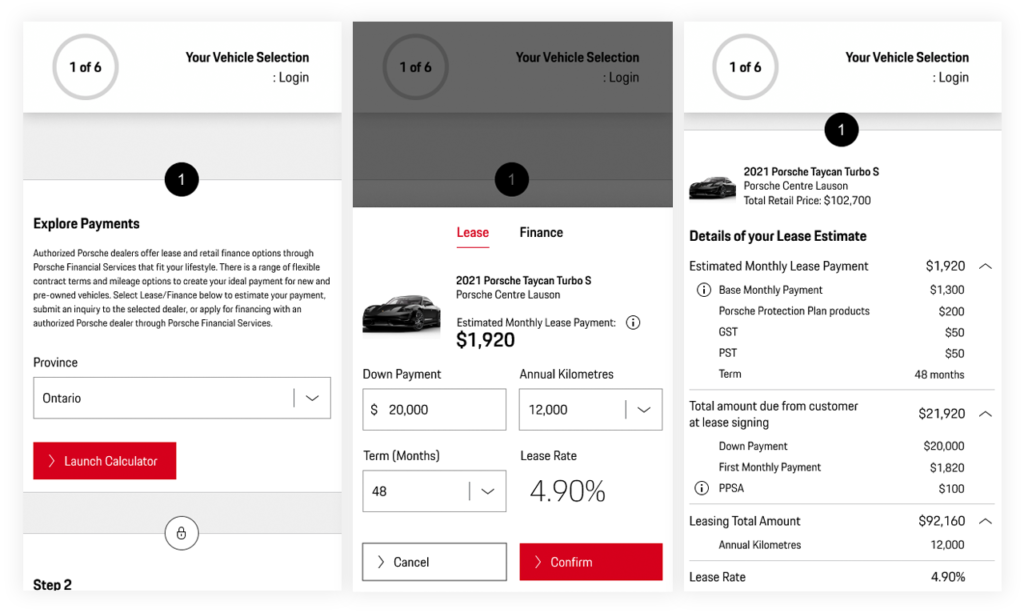
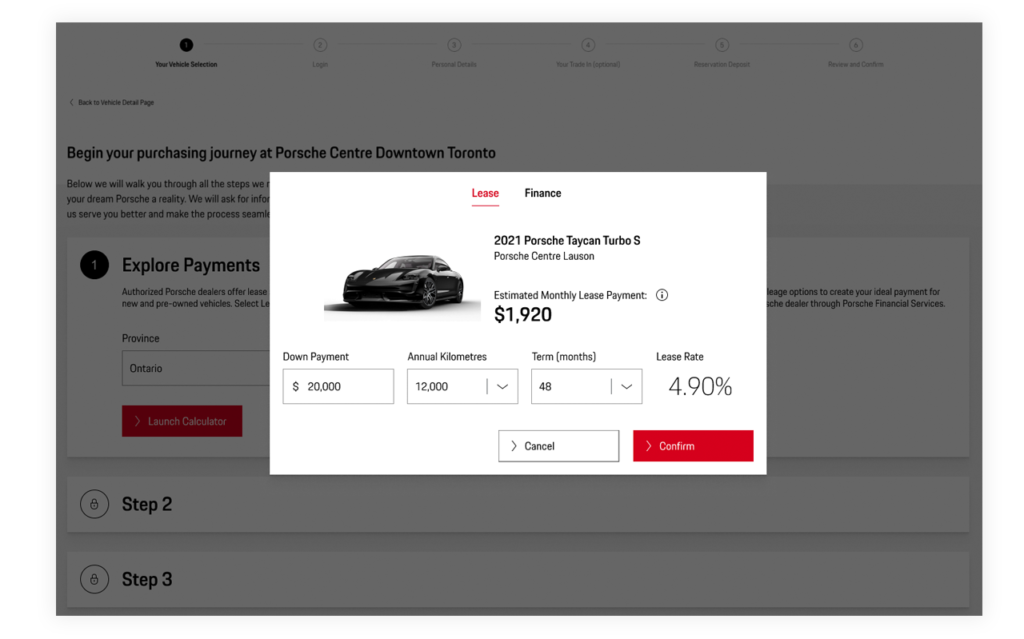
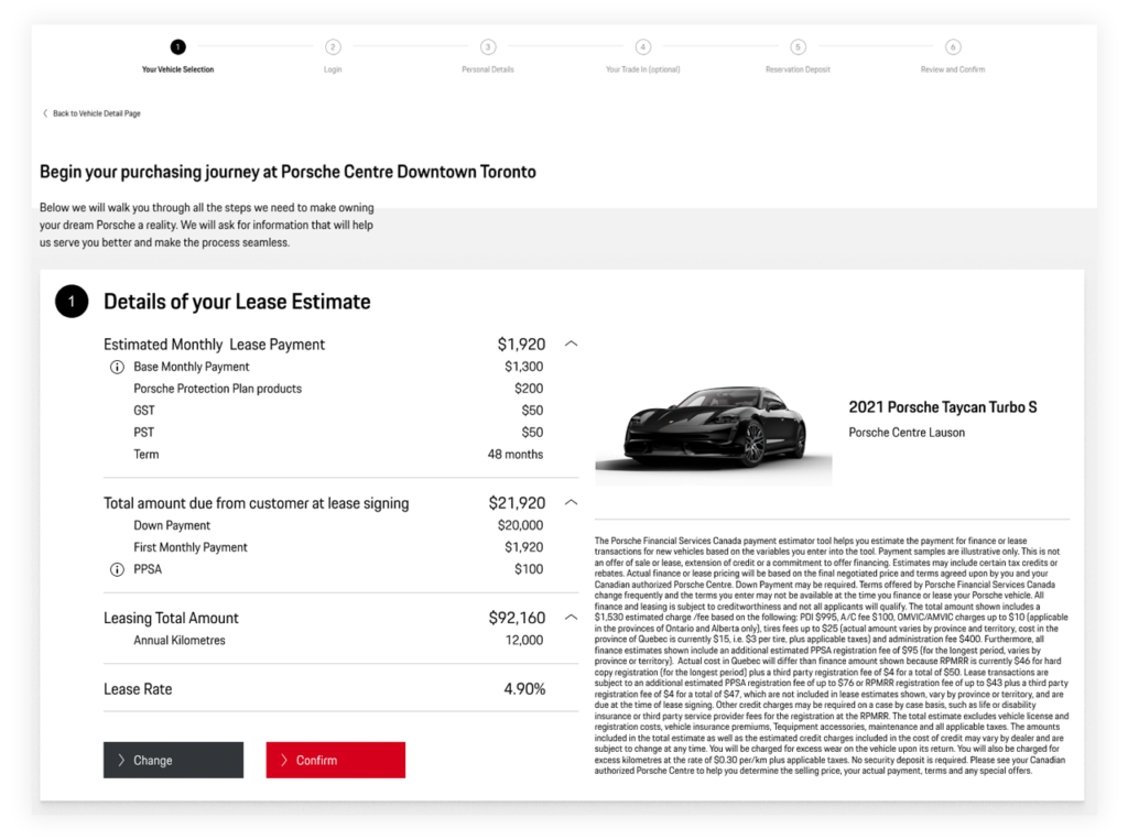
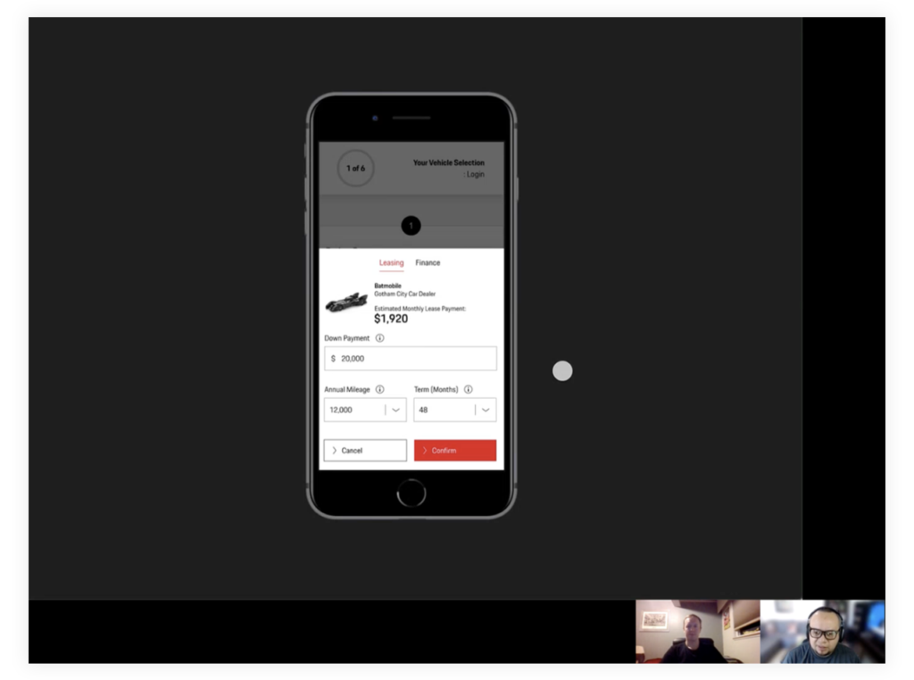
Then I proceeded to create high-fidelity mockups for both desktop and mobile versions, since this was a browser-based solution.
From here I had continuous cycles of reviews with the client and the legal department, as I mentioned before, it was high priority to be sure that all the legal information as well as the correct operation of the calculator were correctly designed and implemented.
After those reviews, I proceeded to facilitate user testing with 10 users, to validate the hypothesis that I made with the heuristic evaluation document.
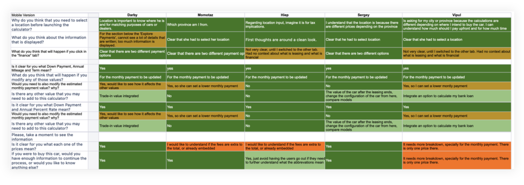
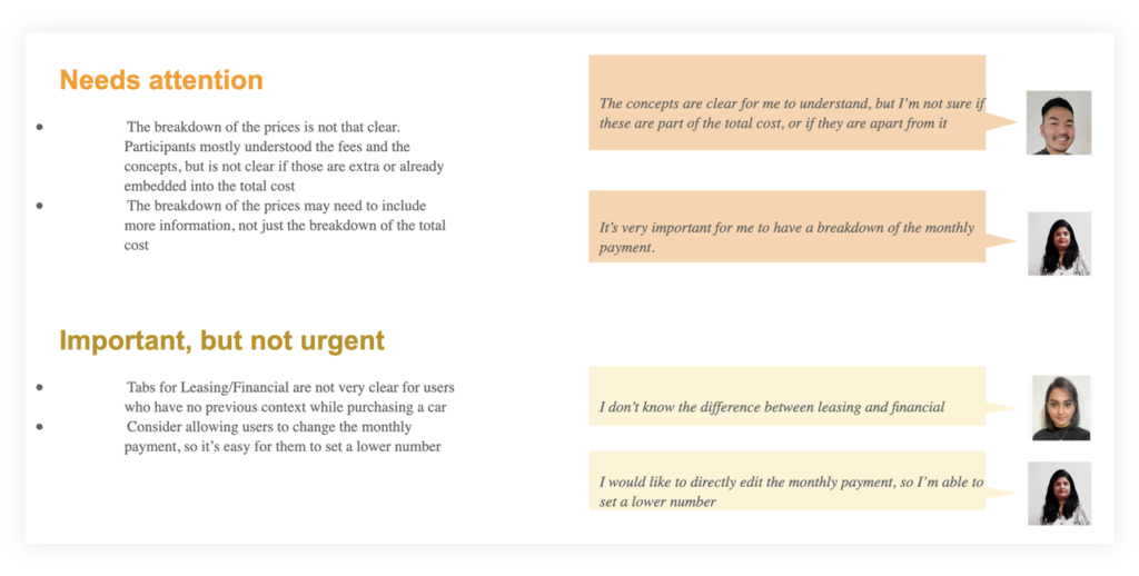
The testing went very well, there were just some areas of improvement that had to do with the content and some design elements, but my hypothesis about the operation of the calculator were correct. I proceeded to improve the designs based on that feedback.
Impact
I finished the design of the calculator and the stakeholders were very happy with the process, the quality and the results. The next step for them was to negotiate the development and implementation of this calculator, but unfortunately I ended my participation in this project before those negotiations.
Nevertheless, the user testings proved the hypothesis that I made during the evaluation phase: that the calculator worked, but needed to be improved when something didn’t go as expected, like connection errors or incomplete information. There was no communication to the customer about what was going wrong or what was happening, neither what they could do to solve it.
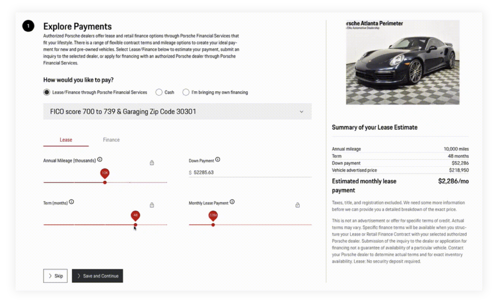
During the user testing, the most positive feedback was about how this version was easier to use, and something that I didn’t consider but was very important for customers was the «wow» factor: in my designs, I thought that it would be cool to display a picture of the car that, as a customer, I wanted to purchase. This was very important for customers during the testings because since this is a luxury and very expensive purchase, they wanted to see what they are purchasing and be motivated about it by seeing the picture during the process.